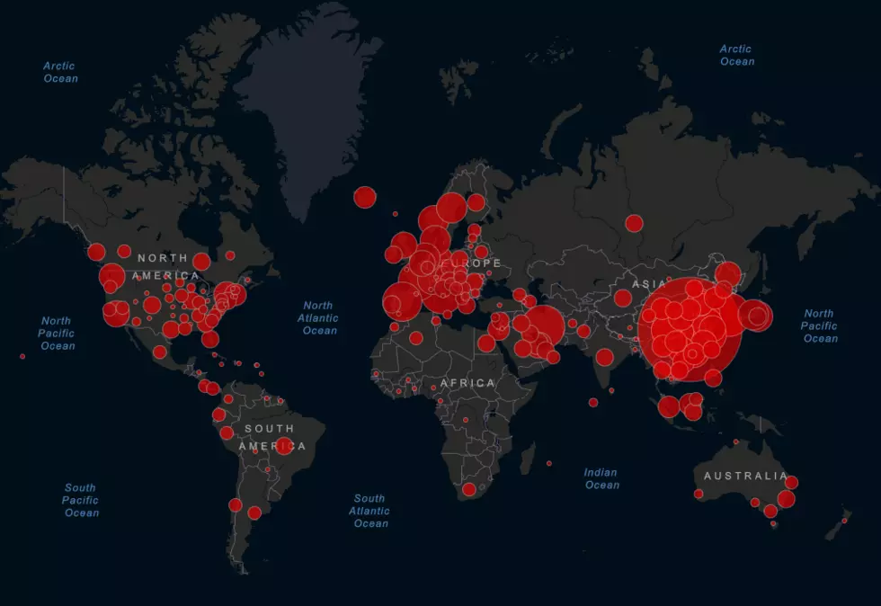
Interactive Real-Time Coronavirus Map
With all of the cancellations, postponements, and news regarding the Coronavirus, it’s easy to be swept up in the emotion of it all. It’s hard to know what’s real, what’s not and who to trust. Because of that, it’s important to get your information from trusted sources and among those is Johns Hopkins University. They worked with the Center for Science Systems and Engineering to create this interactive map that shows where each confirmed case of COVID-19 is, along with how many deaths caused by the virus and how many people have recovered. The map is updated in real time and is completely customizable. You can see each region of the world and the country. If you are a data geek like me, you can find yourself spending hours of time on here and given all of the cancellations, it may be one of the only things left to occupy your time for a while.
Click HERE to access the map.
If you have more questions about the Coronavirus and COVID-19, here are some good resources to check out:
Remember that there are also scam artists that will use this to take your money and the World Health Organization is keeping track of them. Click HERE to keep up with it all.
More From 104.3 Wow Country


